Bookstrap4 学习(一)
容器
container 是最基本的lagyout 元素, 并且当使用默认的Grid 系统时, containers 是必须的.
<div class="container">
  <!-- Content here -->
</div>
使用 .container-fluid 获取一个全宽的容器.
<div class="container-fluid">
  ...
</div>
下面讲到网格的时候会有例子可以这两个的区别
响应节点
为适应不同的屏幕大小,当界面变化时进行特定界面变化.bootstrap 定义了一些屏幕大小.分别对应 : sm , md , lg , xl , (英文单词).
// Extra small devices (portrait phones, less than 576px)
@media (max-width: 575px) { ... }

// Small devices (landscape phones, 576px and up)
@media (min-width: 576px) and (max-width: 767px) { ... }

// Medium devices (tablets, 768px and up)
@media (min-width: 768px) and (max-width: 991px) { ... }

// Large devices (desktops, 992px and up)
@media (min-width: 992px) and (max-width: 1199px) { ... }

// Extra large devices (large desktops, 1200px and up)
@media (min-width: 1200px) { ... }
假如我们需要在css文件中指定某个特定的屏幕大小的属性.如下
@media screen and  (min-width: 992px)  {
    .nav-btn button {
        font-size: 24px;
        padding:4px 8px;
        line-height: 7;
        border:none;
        background: none;
        outline:none;
    }
}
注: min 和 max 就像数学中的上下限.
网格
bootstrap 分为12 个网格,
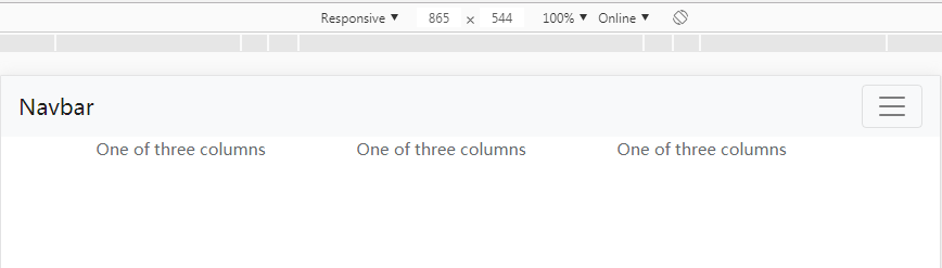
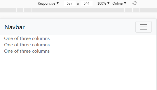
<div class="container">
  <div class="row">
    <div class="col-sm">
      One of three columns
    </div>
    <div class="col-sm">
      One of three columns
    </div>
    <div class="col-sm">
      One of three columns
    </div>
  </div>
</div>
row 中管理着是三个col, 上面代码三个col平分了整个row, –sm 是什么意思呢? 就是在屏幕尺寸在sm及以上的都是平分的,而小于它的将会从上往下排
把container 换成是 container-fluid ,可以看到屏幕宽度被均匀铺满,而container 是水平居中.网格中需要注意的有:
- container 和 container-fluid 的区别
- col间有间隙,可以通过设定属性,消除间隙,见下例子.
- 在grid layuot 中内容必须放在col 中, row 管理着 col
<div class="container"> <div class="row "> <div class="col-sm"> One of three columns </div> <div class="col-sm"> One of three columns </div> <div class="col-sm"> One of three columns </div> </div> </div>优质内容筛选与推荐>>
1、php项目
2、自上而下的语法分析(递归下降法,LL(1)预测分析法,预测分析表)
3、Vim的分屏功能
4、【转】如何使用Log4j?
5、两种设置disabled属性以及三种方法移除disabled属性